Thursday, February 23, 2012

Seagull Project

I have a new painting on my easel.  The seagulls are everywhere...these two I photographed on Tybee Island in GA last November.  I love all the cool blue tones against the white of the birds and the sparkle of the reflections....
Here is my sketch....
I always do my sketch on tracing paper.  The first reason being it is easier to erase then when drawn directly on the painting surface.  The second reason...I can lay this over my painting as it progresses and make sure things have not gotten out of proportion.  For example, it is very easy to change the curve of the neck or the size of the beak without realizing it.  Many times something may not "look right" but I can't put my finger on it until I overlay my original sketch...then its "oops, there it is"!  I'm going to be trying out a new painting surface with this piece.  I normally use gesso board, but I have decided to give illustration board ago.  I like that I can cut the illustration board easily to any size and it will be much easier to store and ship completed paintings.  I have never painted on illustration board so this will be a learning experience....one I am happy to share with all of you out there in blogland.....

Friday, February 17, 2012

Love of Art Blog Hop

You probably noticed the blog hop button on my side bar.....I have never joined a "blog hop" before, but somehow this one touched my heart.

Why do I love Art.....

Freedom to fly to soar....
To Inspire....and be inspired....
To "Embrace the Beauty" that surrounds us all
To Surprise
To Reach out...to touch and be touched
To be Who I am

"To capture for one brief moment in time.....a moment of Beauty"
to share
to love
to teach


Monday, February 13, 2012

Flamingo Fini!

Here is the final painting....I'm pretty satisfied with myself on this one.  I'll be posting it for sale in the near future on my website.  Trying now to get a good print...now that is a whole n'other subject of frustration!  I have an Epson photo 1400 and I'm printing on Epson paper (photo luster).  The two that I have tried have come out rather dark...so I'm tweaking in photoshop elements to try and get the print as close to the original as I can.  Anyone got any tips on that I'm ALL EARS.  I always feel like I'm wasting ink and paper....cause it takes 4 or 5 prints to finally get it right! 

Tuesday, February 7, 2012

Flamingo Part 3

A little about materials.  I love my acrylics and right now I'm using Decoart's Traditions.  My palette consist of White, Black, Burnt Umber, Ultra Blue, Cream, Raw Sienna, Burnt Sienna, and Grey.  My painting surface is an 8 inch x 8 inch Gesso board with a 3/4 inch cradle.  I'm very detailed with my paintings and I have found Gesso board's smooth surface makes achieving that detail so much easier.  I do plan to try some illustration board at some point and also planning on experimenting with some Golden Acrylics.  I know that is what a lot of Acrylic artist use because they are pigment rich.  I'm pretty happy with Decoart, but always room for improvement!
I know....doesn't seem like much progress for a days work......
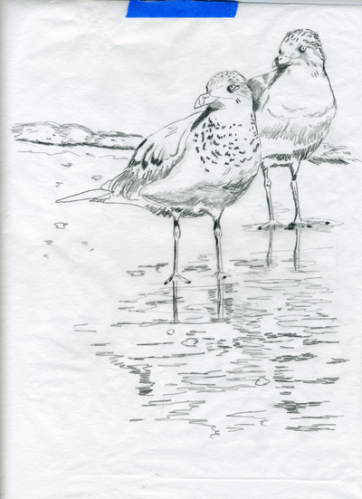
I'm still building up the values on the beak with washes.  I build them up slowly...each layer a little darker or lighter....til I get the richness I'm looking for.  On the head, I have started to lay in the individual feathers.  Many times I will use white or cream to put in the texture then I go back and wash over the hairs with the different values.  I repeat that process as needed. 
Again...each individual feather is painted...lay down the values, then add texture, repeat as necessary. It is a long process, but I do so love the results when it all comes together.  I usually have music playing as I work and my hubby always knows when things are going well with a painting......cause I dance....not unusual for him to see me twirling and singing around the living room.  I just have to let all that JOY out!

Saturday, February 4, 2012

Flamingo Part 2

Here we are....I'm building the basic textures and slowly building up lights and darks.  This is all done with washes of color.  My palette is burnt umber, white, cream, grey, ultra blue, and burnt sienna.  As I lay in the washes I'm careful to keep my brush strokes in the direction of the feathers.
A closer look at the feathers and neck/head area below.  Again...I'm just trying to establish the basic shapes of the feathers and beginning to build layers of color
I do use a matte medium (mixed with 50% water) in between the layers of washes.  It preserves the work completed and aids in adding depth to the painting.